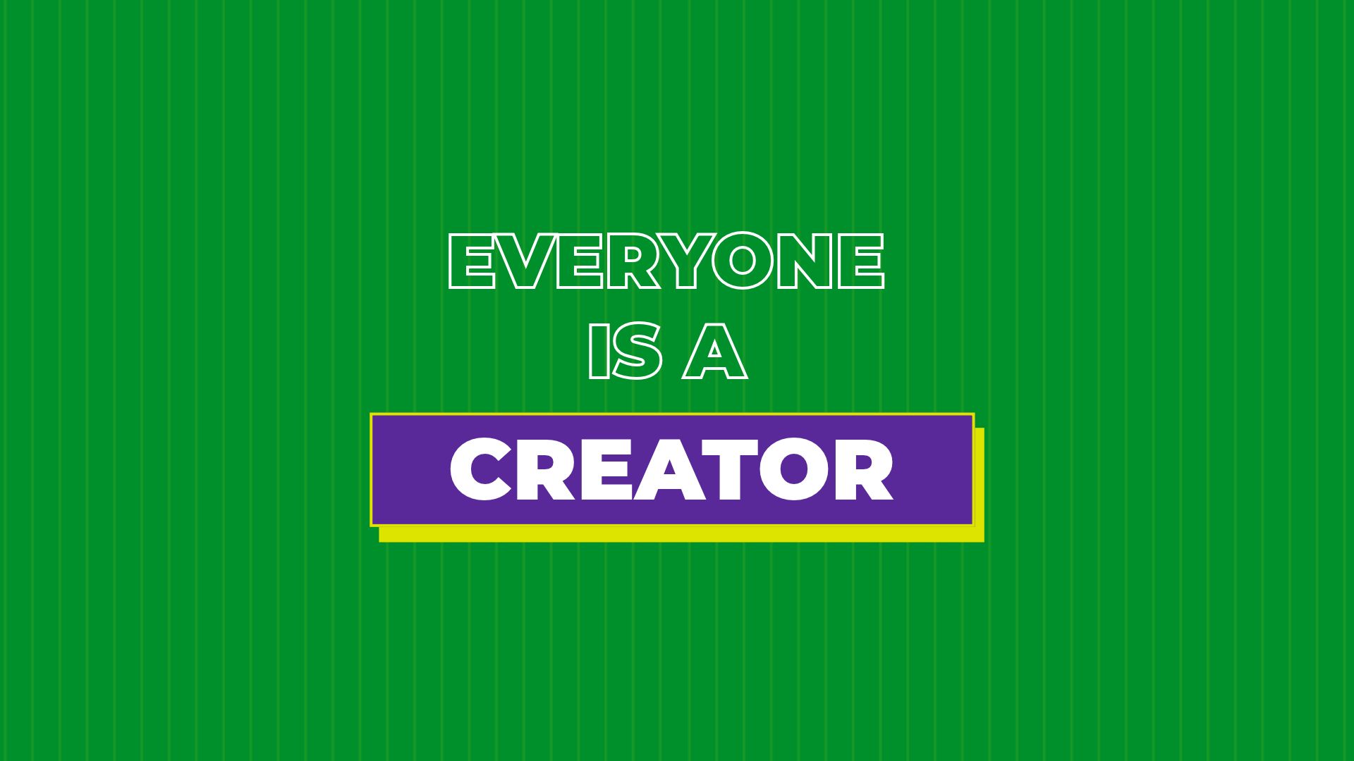
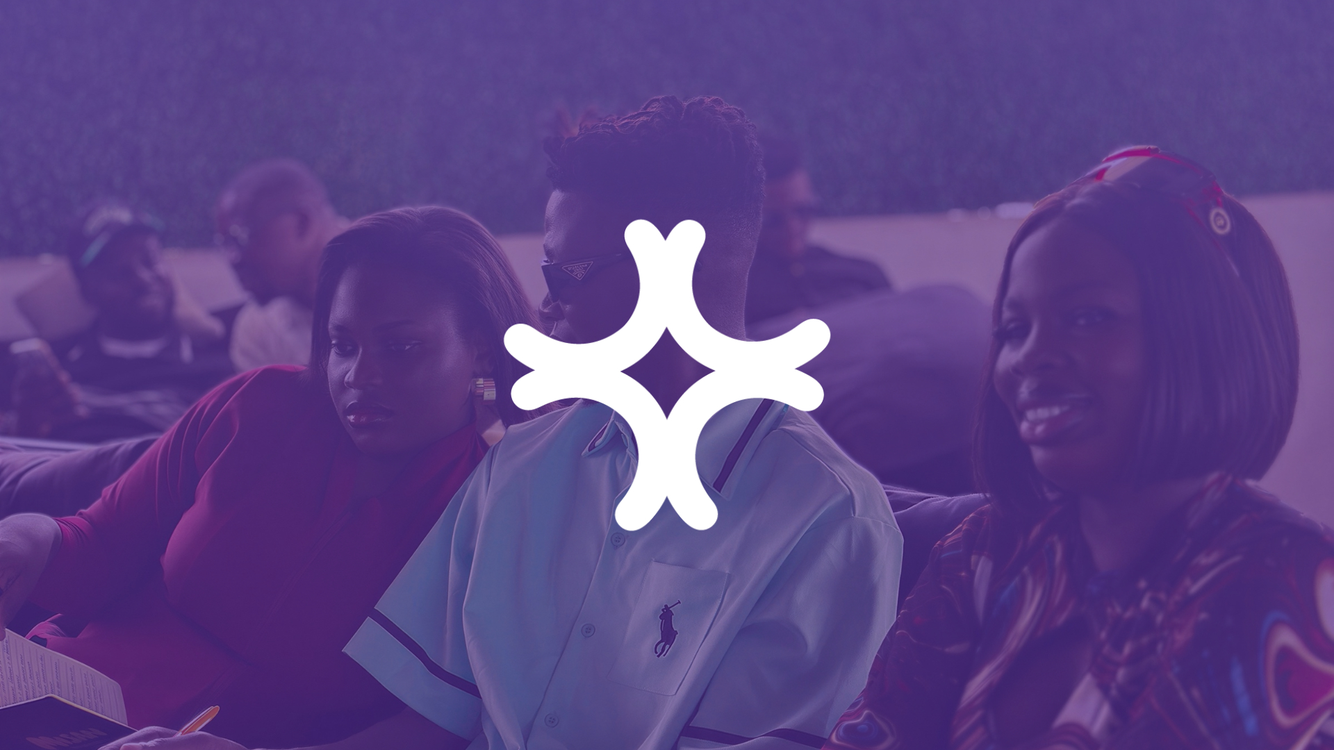
Creators Linkup is a creative community and networking event created to bring together creators, entrepreneurs, marketers, and people building in the digital space.
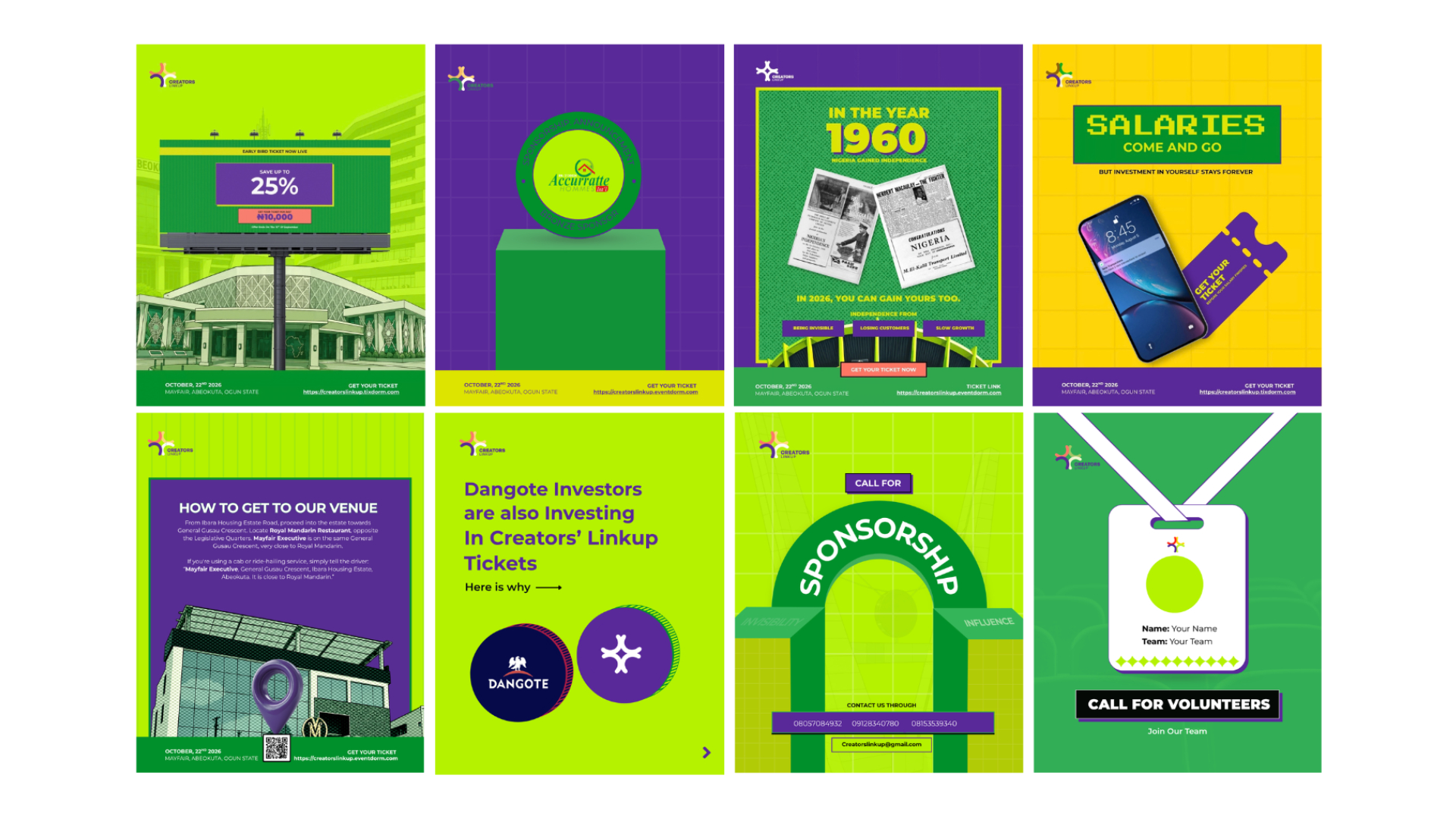
The goal was to create a visual identity that could capture the energy of the creative community while remaining flexible enough to work across social media, event communication, promotional materials, and the physical event experience.
I worked on the brand identity and developed its visual language across the content used to communicate the event.
images/creators-linkup-about.jpg
The problem
Creators Linkup needed more than a logo.
It needed a visual identity that could make the event recognizable, communicate its creative energy, and create consistency across different types of content.
The brand also had to speak to a diverse audience. From content creators and entrepreneurs to marketers, students, and digital professionals, the identity needed to feel inclusive without becoming visually generic.
The challenge was to create a system that could be bold enough to stand out, flexible enough to evolve, and simple enough to remain recognizable across different touchpoints.
images/creators-linkup-problem.jpg
The solution
The identity was developed beyond the logo, with individual elements working together to create a recognizable brand language.
Logo
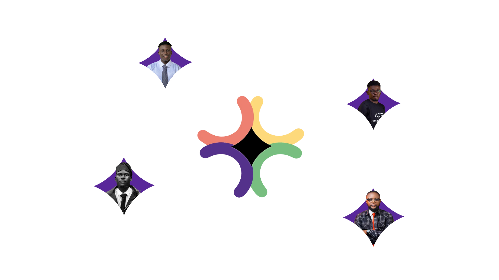
The Creators Linkup logo is built around the idea of creators coming together to create something bigger.
The mark uses the letter C, representing Creators, with multiple (4) C forms coming together to create a star at the centre.
The star represents what can emerge when creative minds connect: innovation, creativity, ideas, collaboration, and new possibilities.
Rather than treating each creator as an isolated individual, the symbol reflects the core idea behind Creators Linkup: when creators come together, their collective ideas can produce something greater than what they could create alone.
The logo therefore becomes more than a representation of the name. It visualizes the purpose of the community itself: bringing creators together and turning collaboration into something meaningful.
Typography
Typography was used to give the brand a strong and contemporary personality while maintaining clear information hierarchy across event and social media content.
Colour
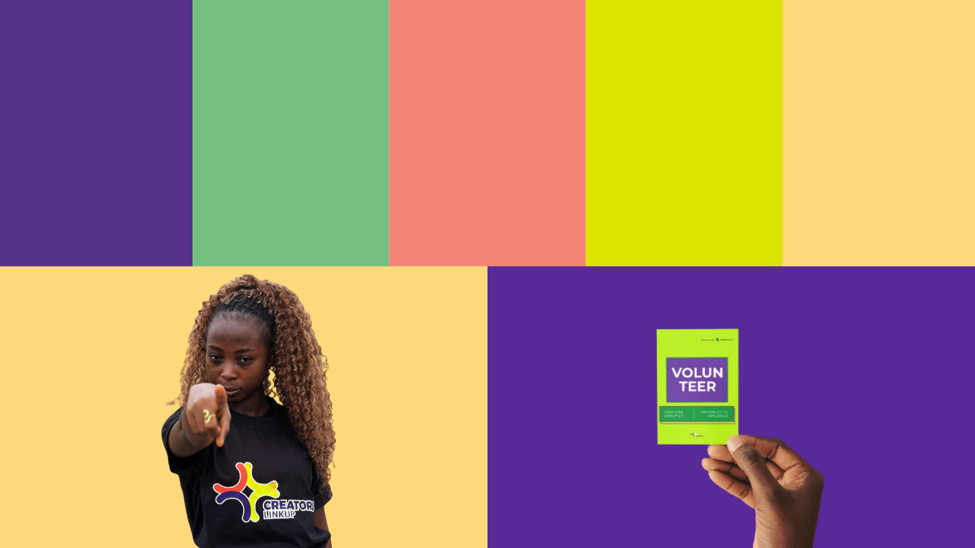
The colour system was developed to give the brand a distinctive presence and create consistency across different communication materials.
Graphic Elements
Graphic elements were introduced to give the brand more flexibility.
These elements could be combined, repositioned, and adapted depending on the message being communicated while still maintaining a connection to the overall identity.